Mapping Everything You Need to Know About the U.S. Population
Where we're getting older, younger, richer, poorer and more diverse.
America is getting older, more diverse, younger, and families by and large have less and less money to respond to changes in their lives and lifestyles and even maintain their status quo. These are some top-level lessons we can now put some numbers behind thanks to our friends at the U.S. Census Bureau and all of you who have ever filled out a form for the American Community Survey. I won’t get too wonky on you here, but the Census just released its 2010-2014 data which can then be compared to the previous five year period 2005-2009. The previous set included the start of the recession. This phase takes us out of it. Clearly the nation was going through huge economic shifts, but it was also going through geographic and demographic ones, too. This will be the first of several posts diving into this data but here’s what you most need to know:
Why Do People Move? Here Are the Top 5 Reasons
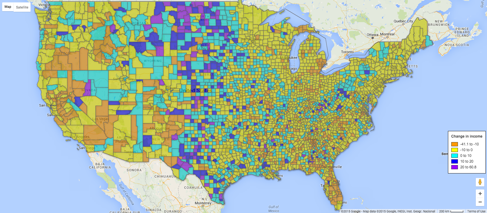
First, let’s talk about income. Because that’s the scary story and really the only story we have any control over. The areas in blue and purple show counties where median incomes increased from the first period to the second period. Remember the recession mostly took place in the first period so things should be really picking up in the second period, right? Right. That’s what should be happening, but as the map shows us, that’s not at all the case. Two thirds of counties saw their median household incomes fall. Now, I’m not an economist, but I think it’s safe to say that having less income (in inflation-adjusted dollars) is a bad thing.
In This Article
Where America is getting older
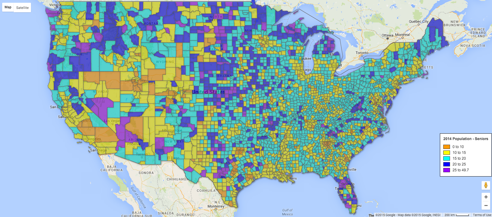
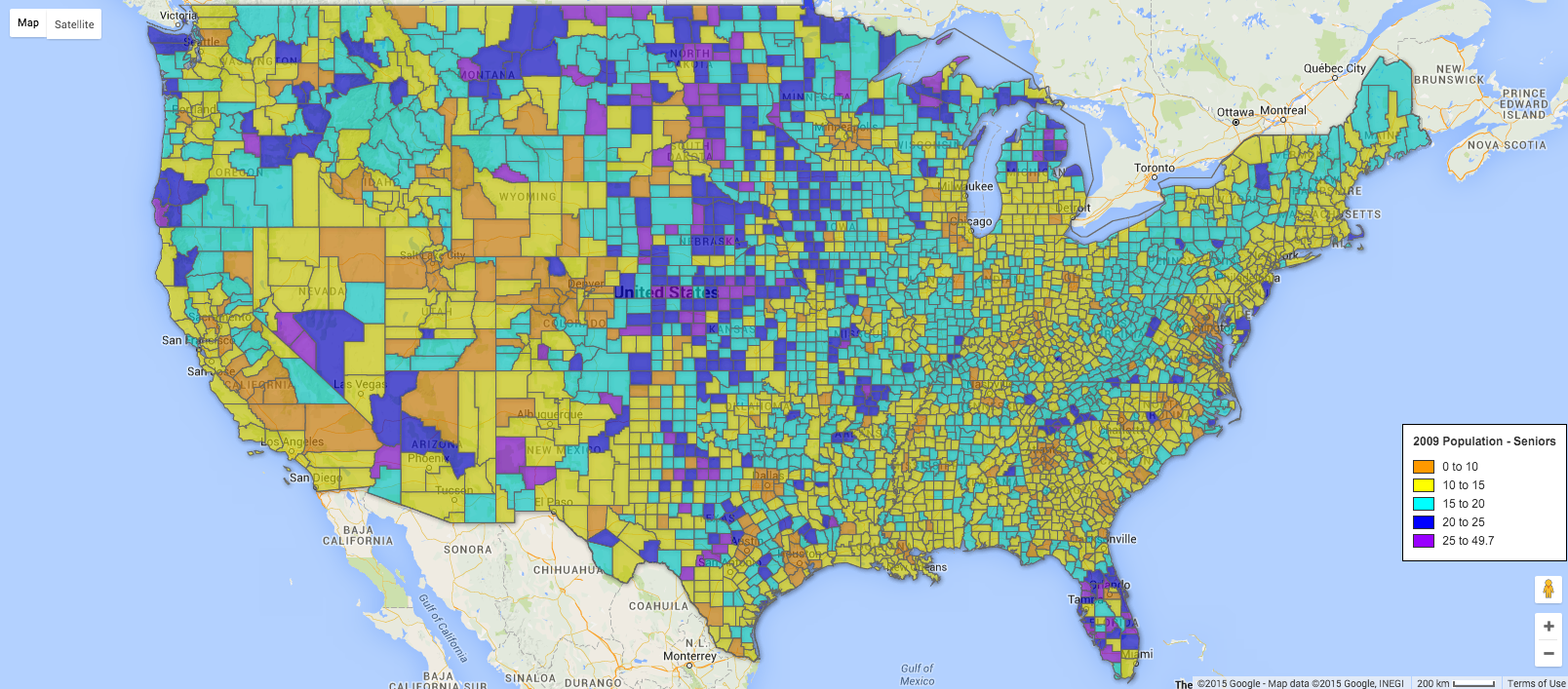
Next, let’s look at where we’re getting older. The answer is: pretty much everywhere. The orange and yellow counties are relatively low percentages of senior citizens. The blues into the purples start getting into progressively higher percentages. You’ll see that in the current data there is a lot more blue, filling in along the eastern seaboard, and Midwest, but also along the south and the Great Plains. Up in the North and Northwest the existing blues get darker and darker. In traditional retirement areas like Arizona and Florida we start to see more and more purple popping up.
This shows us two things. Clearly we’re getting older pretty much everywhere. That’s one important thing to consider in terms of public policy and how we plan our housing and our cities. No city is immune from addressing the issues of the aging population. Second is that clearly many seniors aren’t relocating when they hit retirement age. In some cases that’s because they’re not really retiring. In some cases, they want to stay in the communities they have friend, roots and investment in. Regardless, as I said, this isn’t just an issue for Florida.
Where America is getting younger
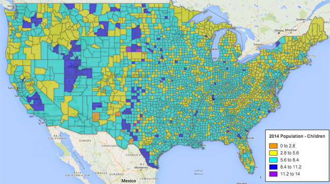
Ok, we’re getting older. But where are we getting younger? Let’s look at where the youngest children (ages 5 and under) are and how that’s changing. Oh wait, that’s not a very rosy demographic picture either. In only one in five counties did share of children in the population increase. A lot of trends are happening here. We, as a nation, are having fewer kids and we’re having them later in life.
Where Are Millennials Moving to?
Also, financially stressed households and households during periods of financial stress (not necessarily the same thing) have fewer kids. Are we poised for a second baby boom now that the economy is getting better and the enormous millennial generation is moving into its peak kid-having years? The common thought is not necessarily, but we’ll know a lot more in the next five years.

Where is America becoming more diverse
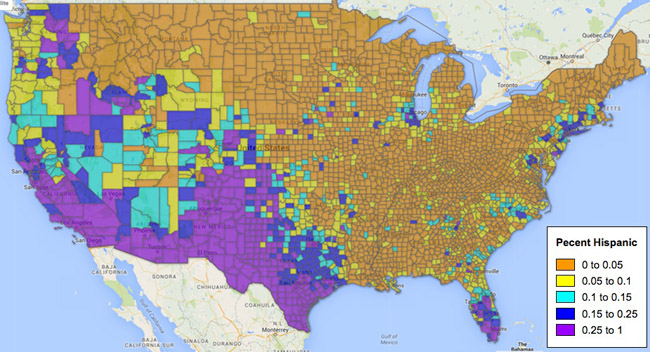
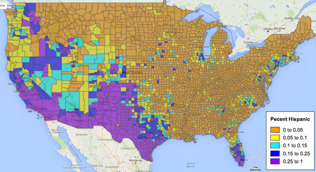
In nearly 90% of counties the Hispanic population grew. However it grew to uneven extents. In the 2009 map (bottom), there are not unexpected concentrations in the southwest and west. But if you look closely, you start to see some of the orange areas creep up into the yellow. Some of the blues shift darker. And some of the dark blues pop to purple. In five years, this will shift even further, partially due to the increase in sheer numbers and partially due to the aging of the non-Hispanic population. Those two things will yield bigger and bigger shares in counties throughout the U.S.
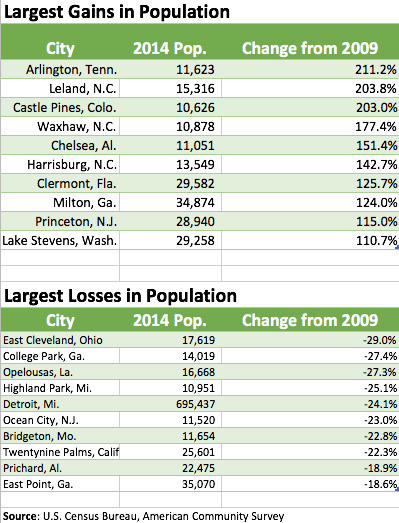
Where America is gaining and losing population
The data read as follows: